
Search News
Industry Portal
Hot Articles
Commercial Indoor Lighting 4000K: When It Improves Focus and Visual Comfort
Time
Click Count
Commercial Indoor Lighting 4000K: When It Improves Focus and Visual Comfort
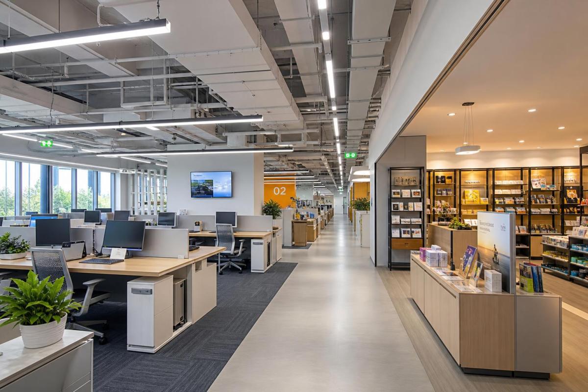
Choosing commercial indoor lighting 4000K is often a practical balance between alertness and comfort for offices, retail floors, and mixed-use facilities.
It sits between warm white and cool white, so spaces feel clear without becoming overly clinical.
For teams managing construction, retrofit, or fit-out delivery, that balance matters more than many specifications suggest.
The wrong color temperature can increase visual fatigue, distort finishes, and create complaints even when illuminance targets are technically met.
By contrast, commercial indoor lighting 4000K often supports focused work, cleaner sightlines, and steadier visual comfort across long operating hours.
That does not mean 4000K is always the right answer.
It works best when matched with task type, fixture optics, ceiling conditions, daylight levels, and control strategy.
Why commercial indoor lighting 4000K often feels more usable
Commercial indoor lighting 4000K is popular because it creates a neutral visual field.
People usually read documents, screens, packaging, and signage with less color bias than under warmer tones.
In practical terms, that can improve accuracy during inspection, assembly, inventory checks, and workstation tasks.
It also tends to feel brighter than warm light at the same measured lux level.
That perceived brightness can support energy planning, especially when paired with efficient LEDs and occupancy or daylight controls.
From recent market shifts, a stronger signal is the demand for spaces that support both concentration and occupant comfort.
Commercial indoor lighting 4000K fits that need well in environments that are active, task-driven, and open for extended hours.
Where 4000K improves focus most clearly
The best results usually appear in areas requiring steady visual attention rather than a residential or hospitality mood.
- Open-plan offices with mixed paper and screen work
- Retail stores where product colors must remain believable
- Corridors, lobbies, and support zones in commercial buildings
- Light industrial interiors with visual inspection tasks
- Education and training rooms requiring sustained attention
In these settings, commercial indoor lighting 4000K can help users stay alert without pushing the space into a harsh blue-white appearance.
When visual comfort gets better, and when it gets worse
Visual comfort is not created by color temperature alone.
A 4000K system can feel calm and clear, or it can feel sharp and tiring, depending on fixture quality and layout.
This is where many projects go off track.
If the specification only names commercial indoor lighting 4000K but ignores beam control, UGR, CRI, and surface reflectance, complaints often follow.
Perceived glare usually comes from excessive contrast, poor shielding, bright lens images, or overlit vertical surfaces.
In actual delivery, the safer approach is to assess the whole visual environment.
That means matching 4000K to diffuser type, mounting height, spacing, daylight entry, and workstation orientation.
Conditions that usually improve comfort
- Uniform light distribution across work areas
- Low-glare optics and controlled viewing angles
- CRI 80 as a baseline, with higher values for retail or inspection
- Balanced contrast between task zones and surrounding surfaces
- Dimming controls that respond to occupancy and daylight
Conditions that usually create discomfort
- Bare high-output panels with poor diffusion
- Overlighting beyond task needs
- Shiny finishes that amplify reflections
- Mixed lamp colors across adjacent zones
- No commissioning after installation
Best applications for commercial indoor lighting 4000K
Not every commercial interior needs the same visual tone.
Even so, commercial indoor lighting 4000K performs well across a wide range of project types because it supports operational clarity.
It is especially effective where users move between screens, printed material, merchandise, and face-to-face interaction.
Office and administrative spaces
For offices, commercial indoor lighting 4000K usually supports concentration better than warm white alternatives.
It helps paperwork, keyboard tasks, and shared meeting areas feel visually consistent throughout the day.
Retail and display environments
Retail projects often benefit from commercial indoor lighting 4000K because products look crisp without becoming cold or washed out.
It also works well in back-of-house stock areas, reducing color mismatch between selling and storage zones.
Healthcare-adjacent and service zones
Reception, pharmacy retail, diagnostics support, and clean service corridors often use 4000K successfully.
These spaces need cleanliness, legibility, and a reassuring level of brightness without an overly stark feel.
How to specify 4000K without creating lighting complaints
A workable specification goes beyond naming the color temperature.
When commercial indoor lighting 4000K is selected, the supporting criteria matter just as much as the Kelvin value itself.
- Set target illuminance by task, not by habit or guesswork.
- Define glare control requirements, especially in screen-heavy environments.
- Specify CRI and consistency tolerances for spaces where finishes and products matter.
- Review reflected brightness from flooring, desktops, and wall materials.
- Include dimming, zoning, and commissioning in the project scope.
This also means procurement decisions should not be made on fixture wattage alone.
A lower-cost luminaire can easily raise operational risk if the delivered visual quality is inconsistent.
Quick specification reference
Cost, controls, and long-term project value
Commercial indoor lighting 4000K should be evaluated as part of a wider operating strategy.
That includes maintenance cycles, control integration, occupant feedback, and energy consumption over time.
With smart LED systems, 4000K can work especially well alongside DALI or Zigbee controls.
Those controls allow spaces to adapt to daylight, occupancy patterns, and task changes without losing visual consistency.
This matters in mixed-use buildings where one lighting scheme must support several operational modes.
A well-managed 4000K solution can reduce overlighting, support compliance targets, and simplify future upgrades.
More importantly, it can lower the hidden cost of rework caused by glare complaints, poor color appearance, or inconsistent user experience.
A practical decision framework for commercial indoor lighting 4000K
Commercial indoor lighting 4000K is usually the right choice when the space needs alertness, neutrality, and all-day usability.
It is less suitable when the priority is intimate atmosphere, deep relaxation, or strongly decorative warmth.
The best project outcomes come from treating 4000K as one part of a performance system, not as a standalone shortcut.
Start with task needs, verify the visual environment, and test the fixture package under realistic conditions.
Then align controls, commissioning, and maintenance planning before handover.
That approach makes commercial indoor lighting 4000K far more likely to improve focus and visual comfort in measurable ways.
For most commercial fit-outs, the real question is not whether 4000K is modern enough. It is whether the specification is disciplined enough to let 4000K perform properly.
Recommended News